
Type Specimen Booklet
Description:
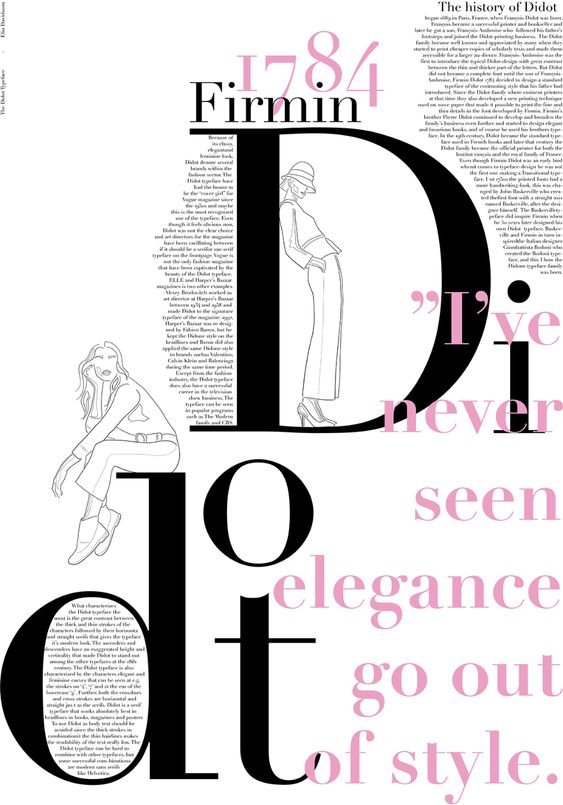
For this project, I picked a typeface to research and romanticize in a type booklet. I chose Didot for its elegance in the fashion and entertainment world. Didot is the font that Vogue has used since 1995, Zara uses Didot and CBS’s old logo used to use Didot as well. These are only a few of the major brands that Didot represents. Each of these represents sophistication, elegance, and beauty in my eyes, therefore I was ecstatic to do more research on this typeface and style it the way I imagine it should be.
Research:
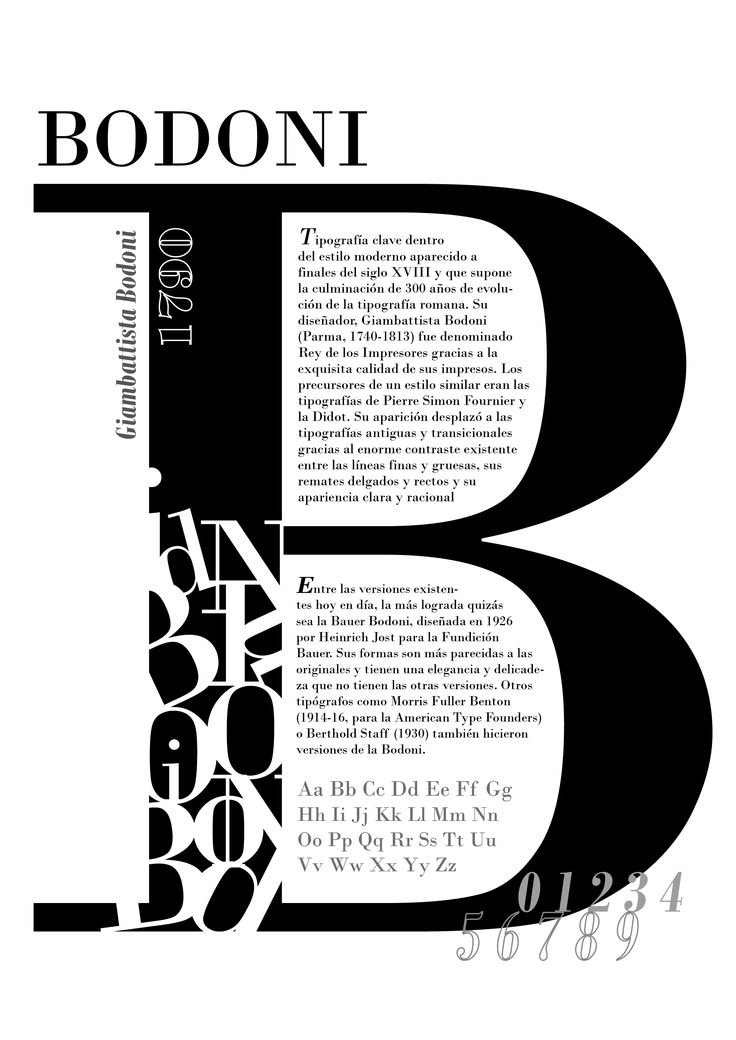
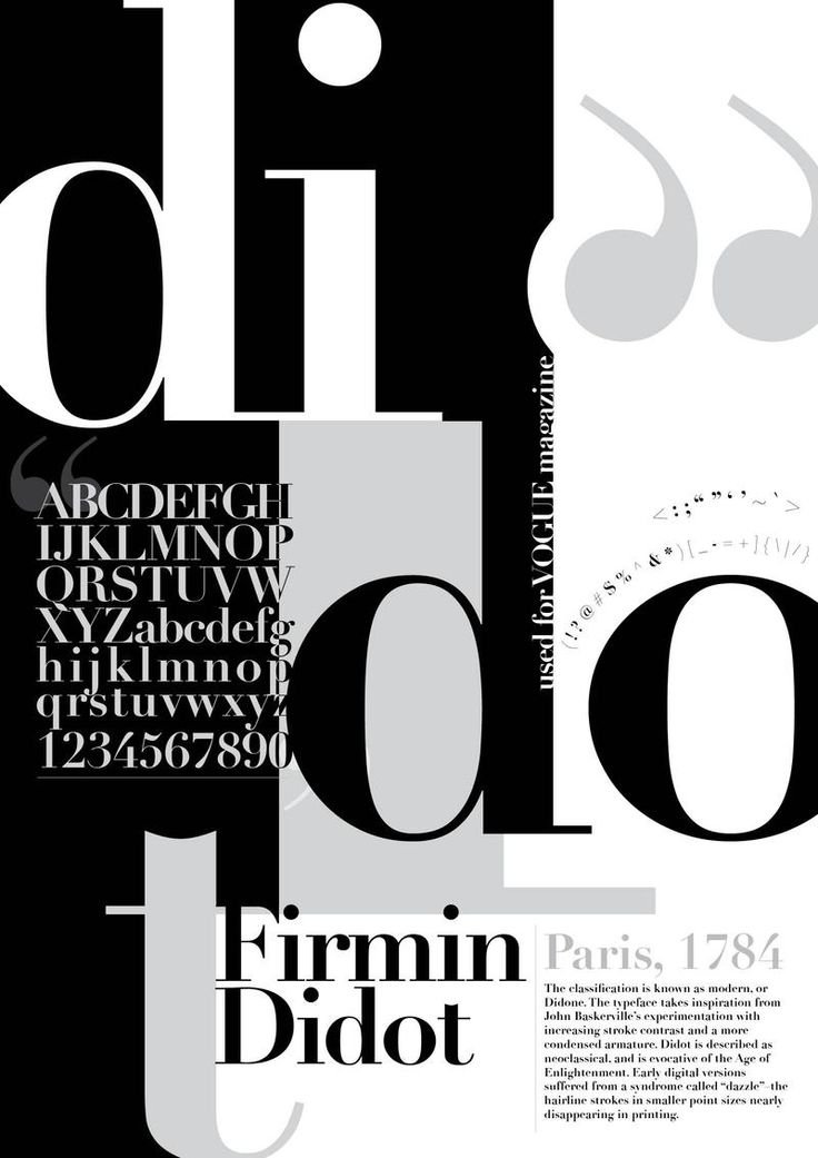
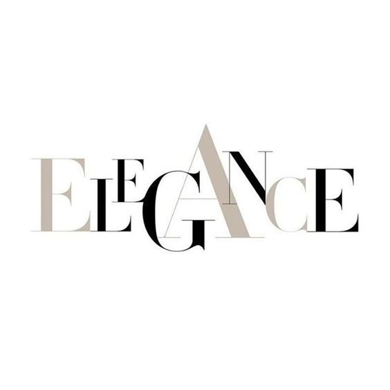
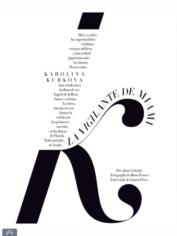
The research below demonstrates the direction I was heading in for this project. I wanted the type to be displayed in an elegant way that would highlight each stroke of the Didot typeface. I liked these designs that I found on Pinterest because of how they intertwined body text with heading text and made it look effortless. I also loved how some designs incorporated people hanging onto the letters. This seemed to also go with the theme of fashion and elegance.


Colors
Different shades of black

Different shades of purple

I decided to use a black-and-white color scheme because the other colors didn’t bring out the boldness of the typeface as well as the black and white does. I utilized the contrast between the two colors to my advantage in this design and showed how the typeface can make a lasting impression.
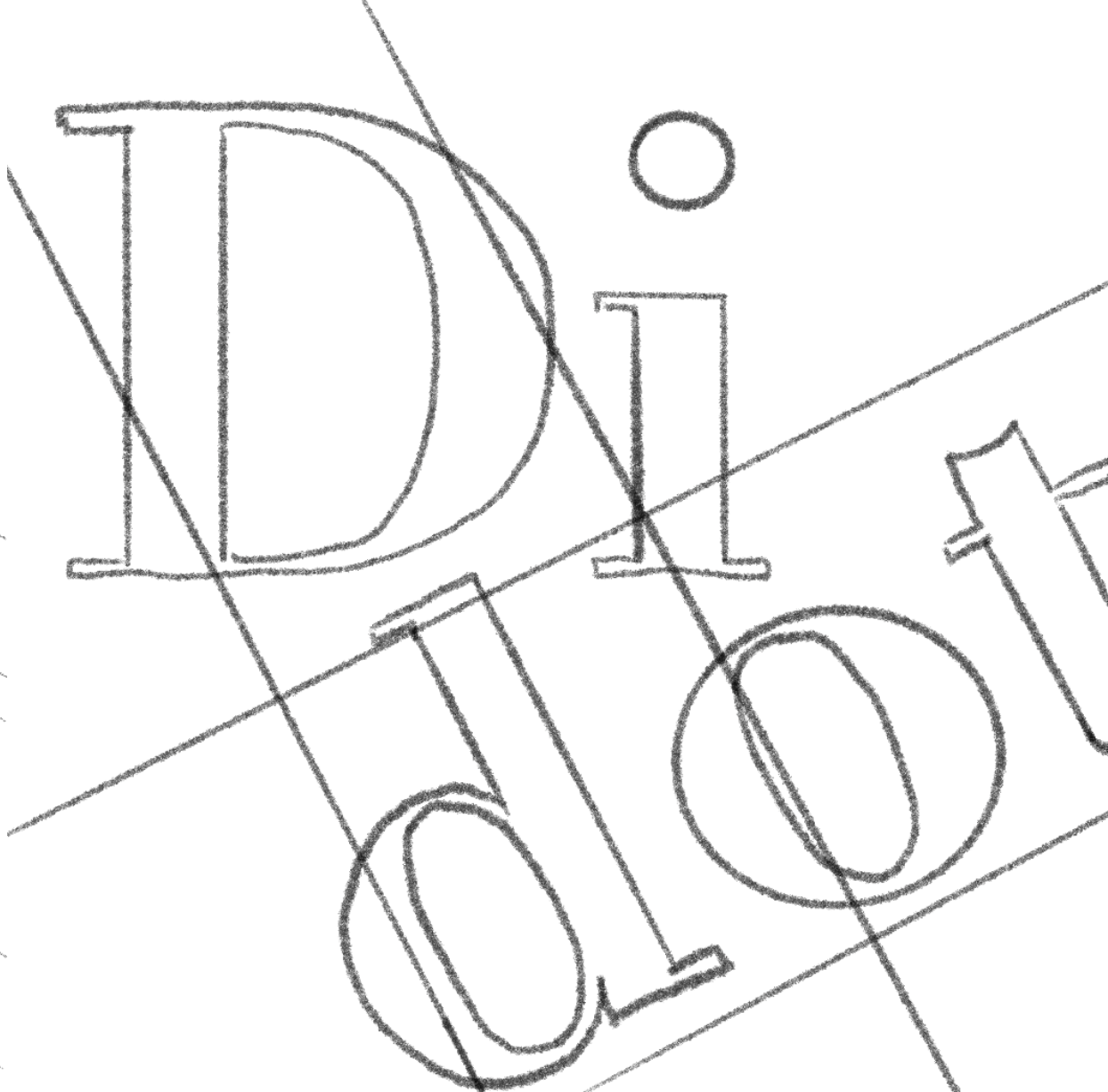
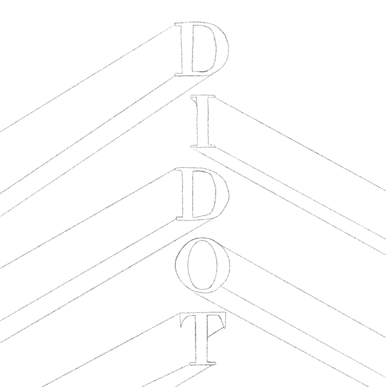
Sketches & Mockups
Below are some sketches and mockups that I created next. After feeling inspired from my research, type studies and color studies I knew it was time to get to work. Along with different shades of black, I played with different opacities to arrange how bold I wanted the typeface to be throughout the booklet. Many of the designs below are accompanied by linear strokes because this typeface is very clean.
Type Studies


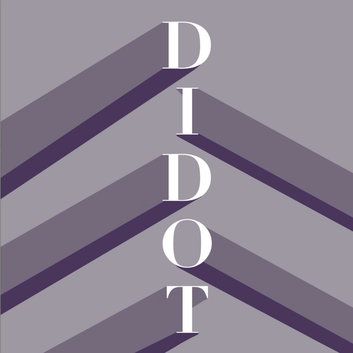
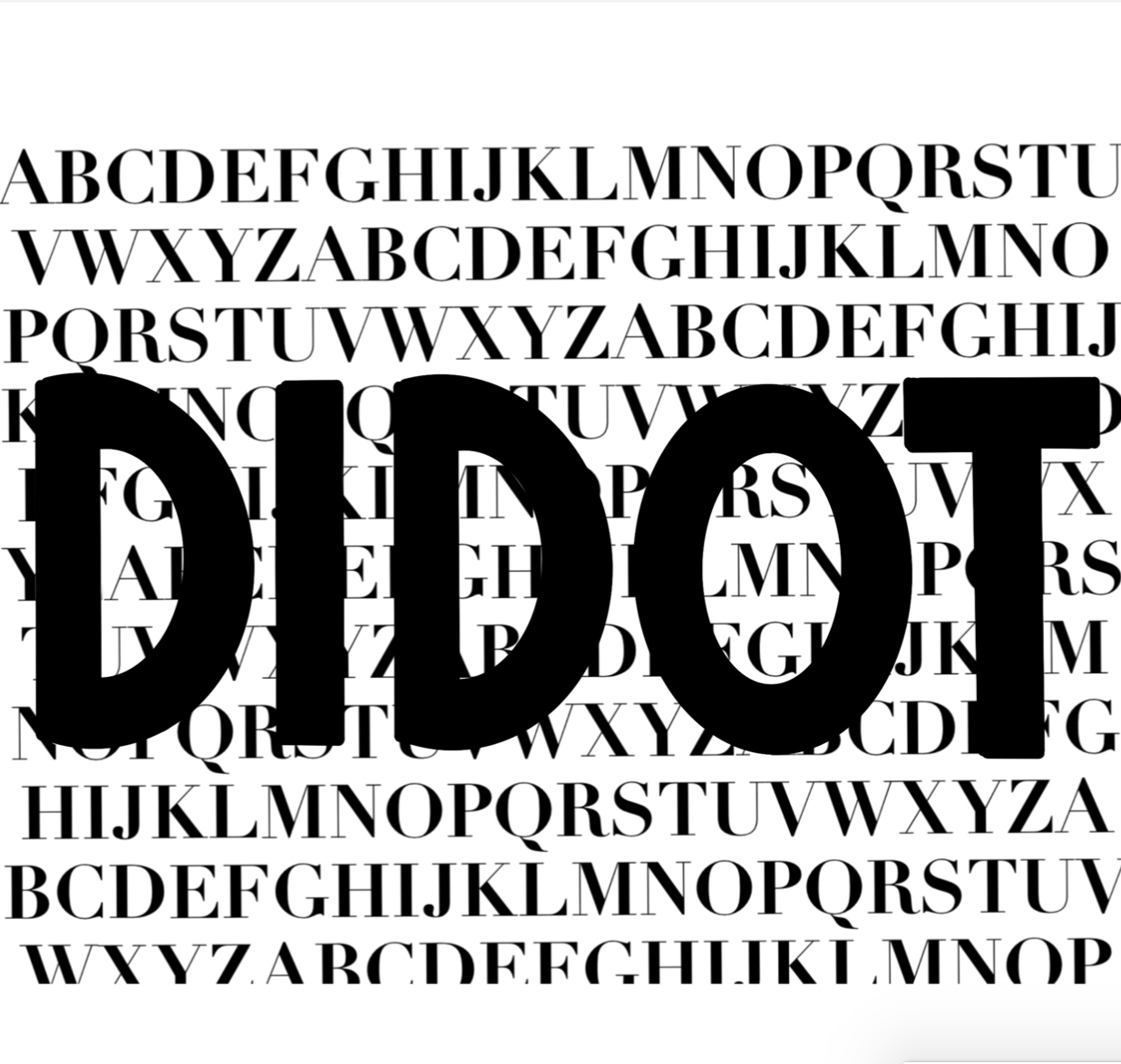

Final Booklet


Conclusion
This was likely one of my favorite projects that I’ve ever done. It was rewarding from the start to the finish and really gave me my first-ever sneak peek into the world of typography. Typography is something that I grew to love so much starting from this very project. I remember browsing through the stacks of typography books in class just looking at different designs for inspiration, and being in awe of the work. I hold so much appreciation for each serif, curve, and linear structure that makes up each typeface.
For this project, I wanted to make sure my appreciation for its beauty came through in the design. I really enjoyed distorting the letters to shape them into a person on one of my pages. I also enjoyed filling the “Didot” word with small words. Overall, I used the contrast between black and white to my advantage to create an inspiring and appealing type booklet. I hope that people gained a new appreciation for Didot as well as for typography as a whole…. it’s a beautiful thing that most people often overlook.