
Mobile App Redesign
Description
For this project, I chose an app that I felt was designed and/or functioned poorly and I re-designed it. This was definitely one of my favorite projects this year because I learned plenty of new tips and tricks in Adobe XD.
The Original App

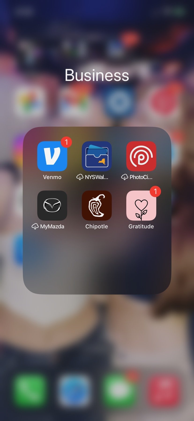
This is what the app looks like from the outside. The heart and flower are not synonymous with the rest of the design once you open the app. Neither is the color pink. Upon seeing the outside of this, I would expect it to be very bright and welcoming.... however, that is not the case.
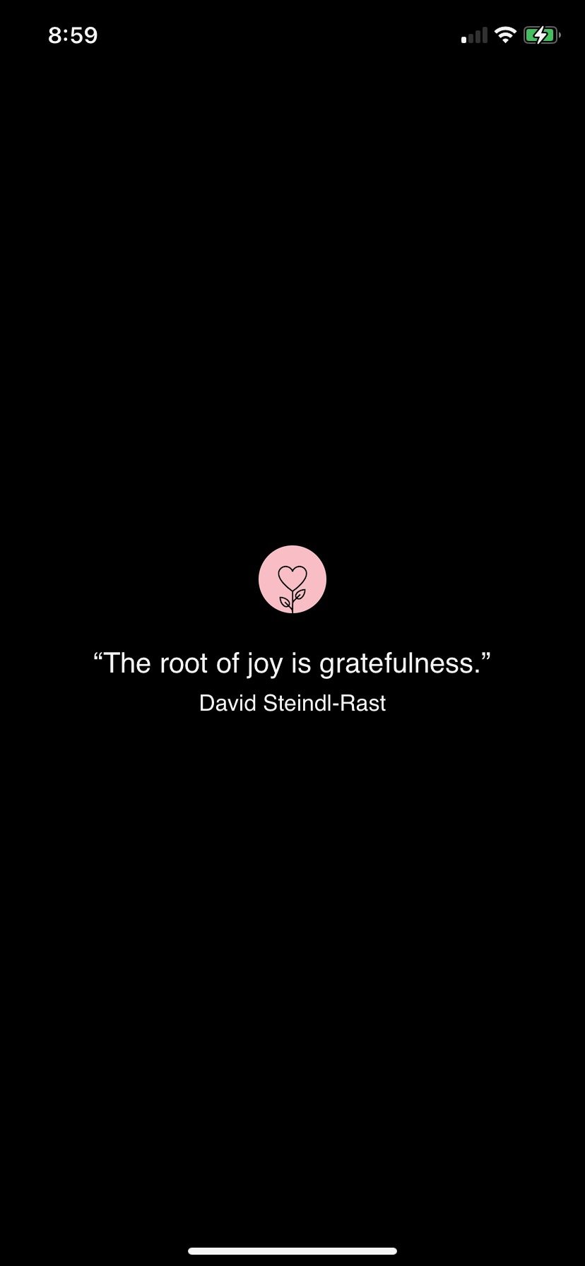
Here is the landing page. I like the idea of having a quote to open up with. I think it has the potential to inspire writers and get their "juices flowing". However, I strongly dislike the black background. I think it's very gloomy and does not match the friendly cover that the app gives off on the home page.
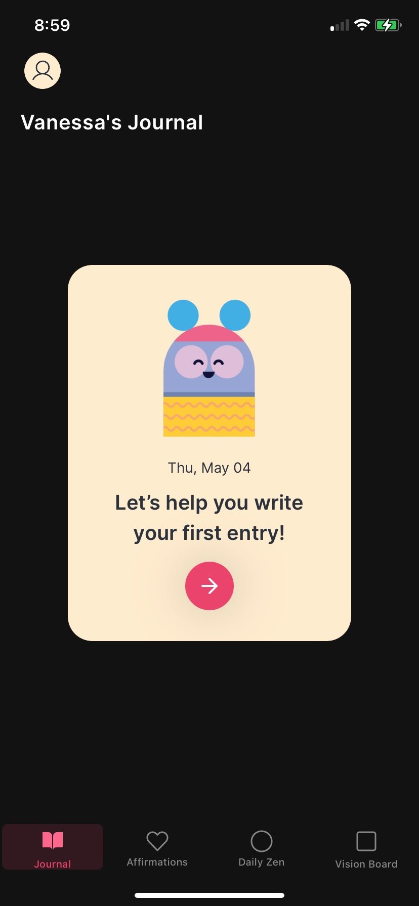
This is the first place the app brings you once it loads. Once agan, the graphics are cute however the black background is very confusing to the overall uplifting, inspiring, and artistic journaling vibe it seemed they were originally going for.

This page is likely my least favorite of all because the information is very cluttered on the page. This is the "affirmations" page, therefore its a place users will go to feel calm, reassured and even loved by the app. However, since the text and elements are so close to one another, the information is difficult to read and a bit overwhelming. I think this would be better if the elements are more spread out and the background was not black. The graphics are great but my attention is very diverted when looking at this and I think it can be much better!
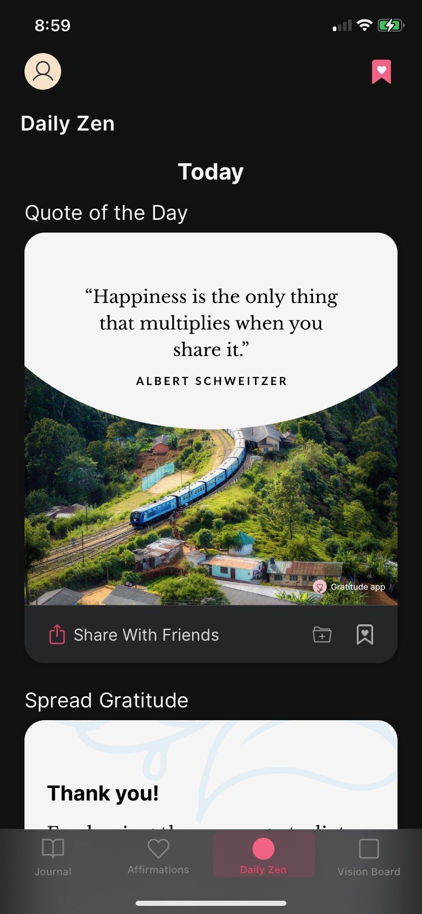
I think this page is a brilliant idea. Who wouldn't love a quote of the day? I loved this idea so I even kept it in my re-design as you will see later. I like the "share with friends" feature as well as the feature image that goes along with the quote. I think seeing an image along with the words allows the viewer to envision an even deeper understanding of the quote and travel deeper into their creative minds. This page does a good job at inspiring the viewer.
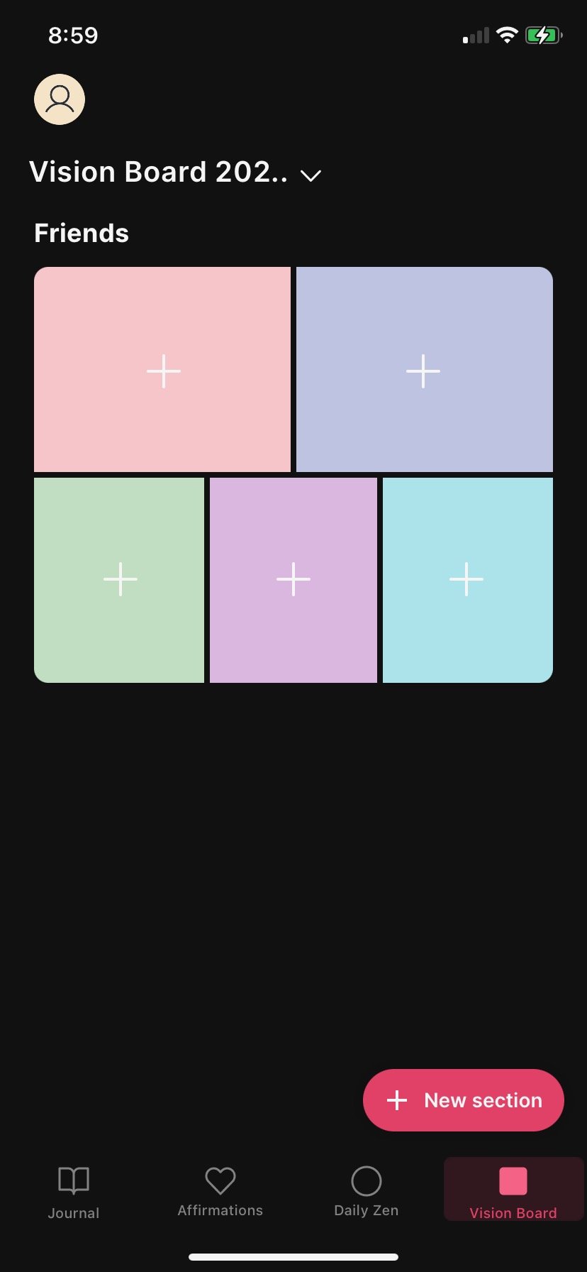
This page is meant so that users can create vision boards! I also really liked this idea because as I mentioned before, I think pictures and words go well together. In case someone isn't feeling particularly inspired to write one day, they can still express themselves using images and placing them together in a creative, non stressful way. The flaw with the design also goes back to the black screen in the background. It feels very much like its pulling me down when I look at this when in reality, I'm expecting more sunshines and rainbows.
My App
Welcome to Pen&Paper, the only place that allows for seamless integration of inspiring and creative journaling to go with your daily routine.
This app offers many features to help with both daily planning and journaling. Psychologists say that the number one way to brighten your day is to journal. We're here to make this possible for you.
With motivational reminders throughout your day, Inspire makes it hard to be discouraged, no matter what is going on.
Wireframes
-
![]()
User Flow #1: Make a journal entry and share it
-
![]()
-
![]()
-
![]()
-
![]()
-
![]()


-
![]()
User Flow #2: Make a vision board and keep it private
-
![]()
-
![]()
-
![]()
-
![]()
-
![]()


-
![]()
User #3: View and comment on someone else's journal
-
![]()


For this part of the process, I created three user goals for that I wanted the users to be able to accomplish while they were using my app.
The first user goal is to make a journal entry and share it. For this, I needed the user to be able to find and understand where the “make journal entry” icon was without the icon having to say anything on it. Therefore, I created a pen and paper icon to insinuate writing or journaling. As you will see in the testing videos below, this worked! Next, I created a page to display prompts for the users to choose from and then choosing a prompt I displayed a blank notebook page, insinuating it was time for the user to write their entry. After writing the entry, the user then had the choice to share or keep private. On this page, I wanted it to be celebratory that they made it this far and finished a journal entry, therefore I made it pink with confetti-like dots on the page. Finally, the user would choose to share their journal entry and they would see it back on their homepage. There are definitely some things wrong with the sketch aspect of this that I fixed later on in the process, which you will see later.
The second user goal is to make a vision board and keep it private. For this, I needed the user to be able to find and understand where the “make vision board” icon was without the icon having to say anything on it (just like before). Therefore, I created a four-square icon to indicate a collage. I think a collage is a good indication of a vision board because that’s essentially what a vision board is; its a collection of images in any way you want on a singular page. Next, I wanted to give the option for users to use their own photos or be able to pick photos from the app. If they clicked from the app, it would bring them to a page that displayed a photo feed. Next, they could customize their vision board using shapes, paint, type, and more. Once completed, the user once again had the option to share their work or keep it private. This time, the user would keep it private so once they selected that, it brings them right to their profile where all their work lies.
Lastly, the third user goal is to view someone else’s journal entry and comment on it. I wanted this app to be interactive in a way where you can explore the other users who are on it. From my experience, I know that one of the main ways I begin to feel inspired is by viewing other people’s work. Therefore, I like this user goal because it gives users the chance to see how other people on the app are doing. First, the user would click on their home feed to choose a journal entry they want to view. Then, they would have the option to comment and share their thoughts. Once they’re done, that comment would show up on the person’s post just like any other social media.
Testing Videos
For my user flows, I tested how a random user would be using my app. This was a super helpful part of the design process because it showed me how some parts of my design may be unclear to someone from the outside. I was able to fix many errors as a result of these testing videos and highly recommend this technique.
User Flow #1
User Flow #2
Color Palette

Type Studies

This project challenged me to expand my color palette. In the past, I was very used to the same tones and kept gravitating back toward them. However, for this I wanted to use more fun and inspiring tones. Therefore, I chose the interesting combination of purple and green that eventually ended up being the color scheme for this very portfolio as well. It took me a long time to figure out how to pair these in a mobile app and make them look as appealing and smooth as I wanted. I played with different tones and tints of both colors and eventually landed on a dark purple combined with a lighter green. I think they pair well together and add good personality to the mobile app.
In addition, the typeface I chose says a lot about the message I want the app to have — fun inspiration. When people log onto the app, I want them to feel inspired just by the design of the app first, then by the contents. I think this font does a good job of grabbing the user’s attention.
Final App


WATCH THE FINAL HERE
Conclusion
This project taught me about the value of spacial ratios and utilizing a diverse color palette in my design. Throughout the process, I was encouraged to broaden my color palette and include more unique colors. This color palette eventually inspired the color ideas for this portfolio website as well.
The impact of my project goes toward the betterment of the user-experience of this app. This app is geared toward people looking to find new ways to be inspired and also give them a safe space to learn.